We live in a world where multitasking and productivity rules. We can access our favourite websites from wherever we are, no matter what devices are being used.
As a result, the spectrum of the screen sizes and resolutions used to sturf the web is growing everyday.
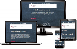
Instead of web developers having to create a version of their website for every single screen resolution, RESPONSIVE Web Design saves the dates by responding to the resolution size and displays the website appropriately on a tablet or on a smartphone.
Responsive web design adapts the content to the resolution for a best possible user experience. It is endorsed by google as their recommended way of dealing with the web.
In the industry, right now, there is a big shift going on, probably one of the biggest I’ve ever seen. Everything is going towards mobiles and responsive design. And this is largely do to this little punks in here, these mobile devices have really changed the way that designers and developers need to work.
If you do a quick google search, you’ll notice that internet traffic coming from mobile devices at the end of last year amounted 27% of total web traffic.
THAT’S A LOT.
As you noticed, the internet moves fast.
How we handled mobile devices?
How we handled RESPONSIVE design?
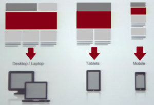
Responsive Web Design provides an optimal viewing experience across all devices from desktop to mobile phones.
The device whether is a laptop, a desktop, a mobile device, android phone, tablet – the website responds properly on any of those devices, the content being displayed for the best read and use experience.
Ethan Marcotte is credited with the responsive web design and he put together three components that make up a responsive web design.
There is a flexible grid-based layout in which as the screen resizes, the grid resizes, so the website is very fluid and he is moving in real time as the browser is being resized.
In another part it must have flexible images and media, meaning video and it must also react as the browser resizes.
And in the last part, are the media queries, which are cascading stylesheet components or CSS and this is where we actually get into writing code and that says something like that : “If the screen is this size, do this thing … if is this size do something else.”
This article will cover 3 simple steps in order to have a responsive design, steps that will make your website to look good on a desktop, on a tablet and also on a mobile device.
Add the Viewport Meta Tag
Most mobile browsers will take your website and skelet it proportionally to the device is stream with. And the problem is that you probably designed your website looks awesome on a desktop, or even better on a laptop. But the annoying thing is you have to pinch in zoom about to navigate your site or whatever is what you made.
Or maybe you are trying to click on a link which is a nightmare, you have to zoom in and then tap on a link.
And here comes your solution!!! Is a way to reset this default behaviour. The meta viewport tag allows to tell the browser to use the device width as the viewport width and disable that initial scale.
// For mobile devices include the viewport meta tag between the <head> and </head> tags.
<meta name=”viewport” content=”width=device-width, initial-scale=1.0″/>
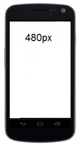
Now, when you’re looking at a Samsung for example, your website will be 480px width and will look like somebody did scrunch in there, and that’s good, that’s what we want.
HTML structure
We are going to think each one of each html elements as being one of two types. Either a container, either a content.
Container elements. A container is an element that we use as a layout tool. It has form, volume, shape. A classic example is the grid container.
First of all, you should create a container. Your code should be like this one:
If you say your grid container has 960px width it’s equivalent with the sintax:
.container {
	width:960px;
}
You can also have containers in containers like a grid column in the grid container. Let me show what I mean: I’m going to add two divs in here… I put a class, named column , and float on to the left.
Html
Css
.column{
	float: left;
}
And that’s all!
The idea here is that all of this container elements are structured and used for layout and they form the structure of the page.
Content elements. Are just like they sounds like → elements that hold the content. If you take per example a paragraph, is as weird as its parent.
So if you have a naked paragraph on a page, it is weird as the page.
Now, my desktop is going to be pretty weird, but on my phone it’s going to be only that 480px width.
The paragraph tag is just holding the content. It’s not describing it’s form. So it’s going to be flexible, it will assume the form of the container that it’s in. So when I put that content in a container, that’s when the MAGIC happens.
Now, just to be clear, content elements are not just paragraphs. Right? They can be images, forms, buttons, specifically anything that is in a container.
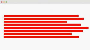
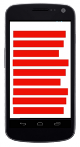
Let’s say that we have a container and it’s 960 px width, just like most of the website on the internet you have ever seen. Problem comes when you view that 960 px width website on a mobile device. Remember the meta tag we talk about earlier? That meta tag keeps the website from being scaled down.
Elements of RD
Responsive design is a combination of the flexible grids and CSS3 Media Queries.
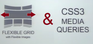
Let’s look at the flexible grids first.
The Flexible Grid
or Fluid Grid
The flexible grid basically adapts the elements and it allows the elements of a page to contract and expand depending on the screen size.It’s all about understanding the ratio-based relationship between elements and containers.
And there is actually a formula for that and it’s called
target ÷ context = result
And that’s gonna be your formula for everything responsive and I’m gonna walk into a few steps to show you how it works.
So what exactly means ratio-based relationship between element and container?
Let’s look at this simple example here.

HTML Markup
target(#content) = 640px
context(#wrap) = 960px
640px ÷ 960px = 0.66666667px => 66.666667%
We would have a container div which I called wrap here and it’s 960px width. And then we have two divs inside, a content div and a sidebar, a very generic structure of a website. So, if you can see, in the simple html markup from above and then if we use that formula, in this case our target is basically the content, so we want to know the ratio-based relationship with the target, the context and it’s container (the wrap).
We calculate the 640px – the target, divided by the context, the container (960px) and we come out with a not so nice number: 0.6666667%. That’s the ratio-based relationship between those two elements. So we just transform that number into a percentage (%) by moving the decimal over two points and we come with 66.666667%.
This is not a very pretty number, but you shouldn’t round that number in anyway because the browser is gonna be able to calculate and adapt your site better because it can calculate better.
CSS
#wrap {
	width: 960px;
	margin: 0 auto;
}

#content {
	width: 66.666667%  /* 640px / 960px */
	float: left;
}

#sidebar {
	width: 31.25%  /* 300px / 960px */
	float: right;
	display: inline;
}
So you just use that number as you can see in the CSS. I leave the wrap div as a fixed width of 960px and then for the content div, instead of using a fixed pixel width, I used percentage (%).
If you set a % width, that will allow the elements to contract and expand depending on the screen sizes. And the same you can do for the sidebar.
Changing the Context!
It’s always important to know the context: what is the container and which is the element inside the container that you want adapt responsively.

HTML Markup
target(.left) = 290px
context(#content) = 640px
290px ÷ 640px = 0.453125 =>45.3125%
CSS
.left,
.right {
	width: 45.2125%  /* 290px / 640px */
	float: left;
	display: inline;
}

.right {
	float: right;
}
In the example from above, we have two divs inside, the left div and the right div and we want make those two responsive.
The context here is the content div. I used the formula I told you earlier and in this case I came up with the result 45.3125%.
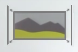
Flexible images and media
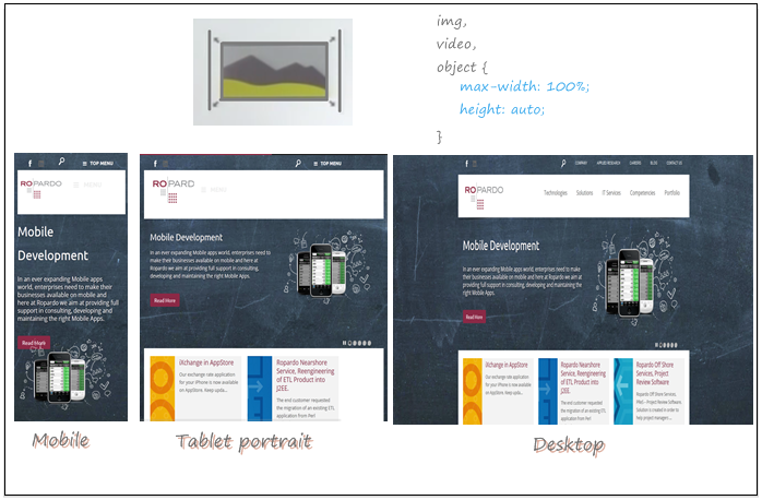
In the example from above, you can see that the actual pictures are gonna expand and contract and they are flexible depending on the device sizes.
So what you can do, is just set in your CSS an image to a maximum width of 100%, which means: if the screen size is smaller than the actual size, it’s gonna reduce its size and it’s gonna fit the screen. But you also need to set the height to auto, otherwise is not scaled proportionally and it’s not gonna look pretty. The same thing you can do for video or object.
The power
of Media Queries
Now, the last ingredient that we need for our responsive pages is to have the control of containers and help them conform. And we’ve gonna do that with media queries.
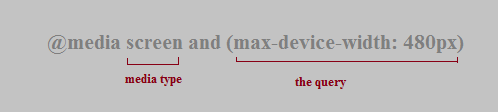
Media queries are a little snippet of CSS that query or ask the screen what size it is. You can tell a media query to look for all kinds of conditions.
A few words about media queries: media queries are very flexible, you can check if a viewport is smaller than a circumcised or wider or even shorter and taller than the defined height you give it.
In this example the screen is the media type and the query in this case is maximum device with a 480px.
We can also add two media queries to a media query to narrow down more what you want to filter.
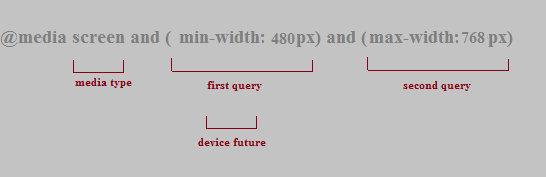
Min and max width are device features. There are several different device features that can be use in media queries, for example: minimum, maximum device width, the height, the aspect-ratio, resolution and a few more.
So if you want to make things responsive for a specific device, you gonna have several options to choose from.
Media queries in combination with CSS
You have the media query and then you set your styles.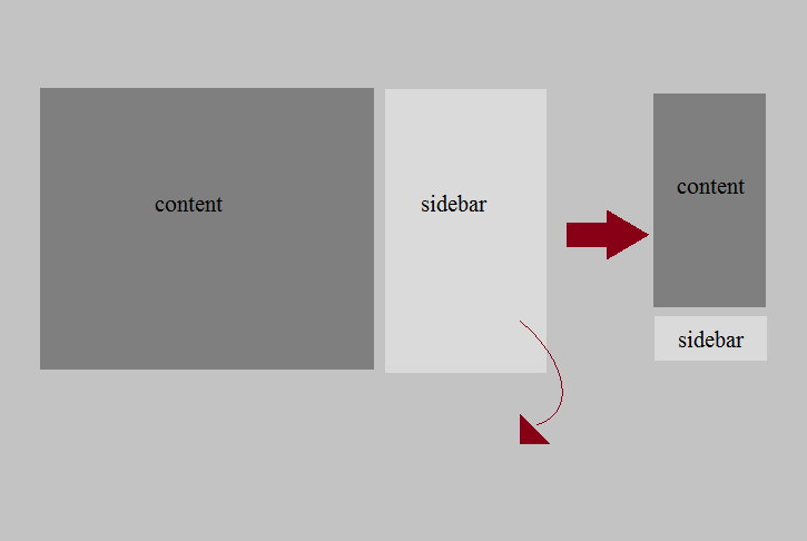
@media screen and (max-device-width: 480px) {
#wrap {
	width: 100%;
}
#content,
#sidebar {
	width: 100%;
	float: left;
	}
}
And the coolest part is coming now … we can do the mobile part using some frameworks, for example : Bootstrap, or Foundation framework. But this will be discuss next time.
If you get interested, you can find more about them following this links:
Final thoughts
-
I would really suggest you to start slow, create the grid, make it flexible.
-
Then make your images flexible.
-
And then add maybe one media query or two media queries to start with. (@media screen and …)
-
Then focus on details.
There is a lot more about on this subject, but using the things I’ve mentioned in this article is a really really good start.
So … Good luck and have fun with it!